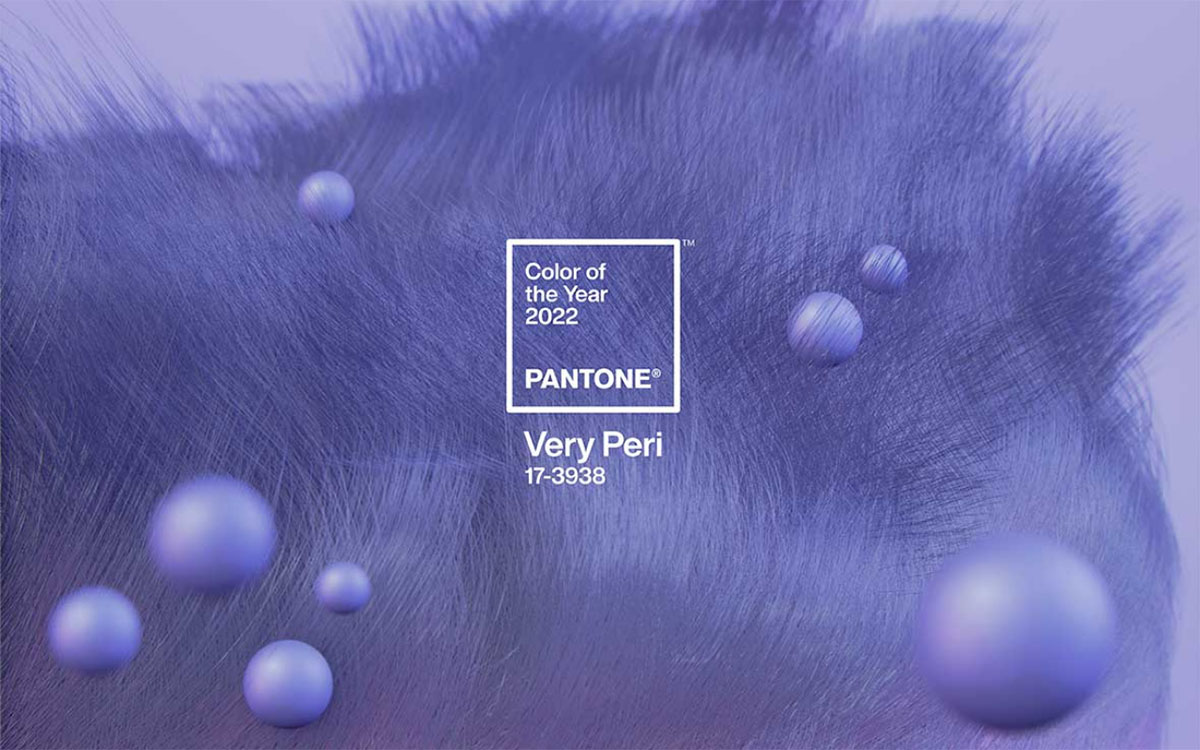
The highly anticipated Pantone Colour of the Year has been announced for 2022 as Very Peri – “a new Pantone colour whose courageous presence encourages personal inventiveness and creativity.” As we adapt to our new post-pandemic way of life, it was only fitting that, rather than choose an existing hue, Pantone invent an entirely new shade for the year ahead.
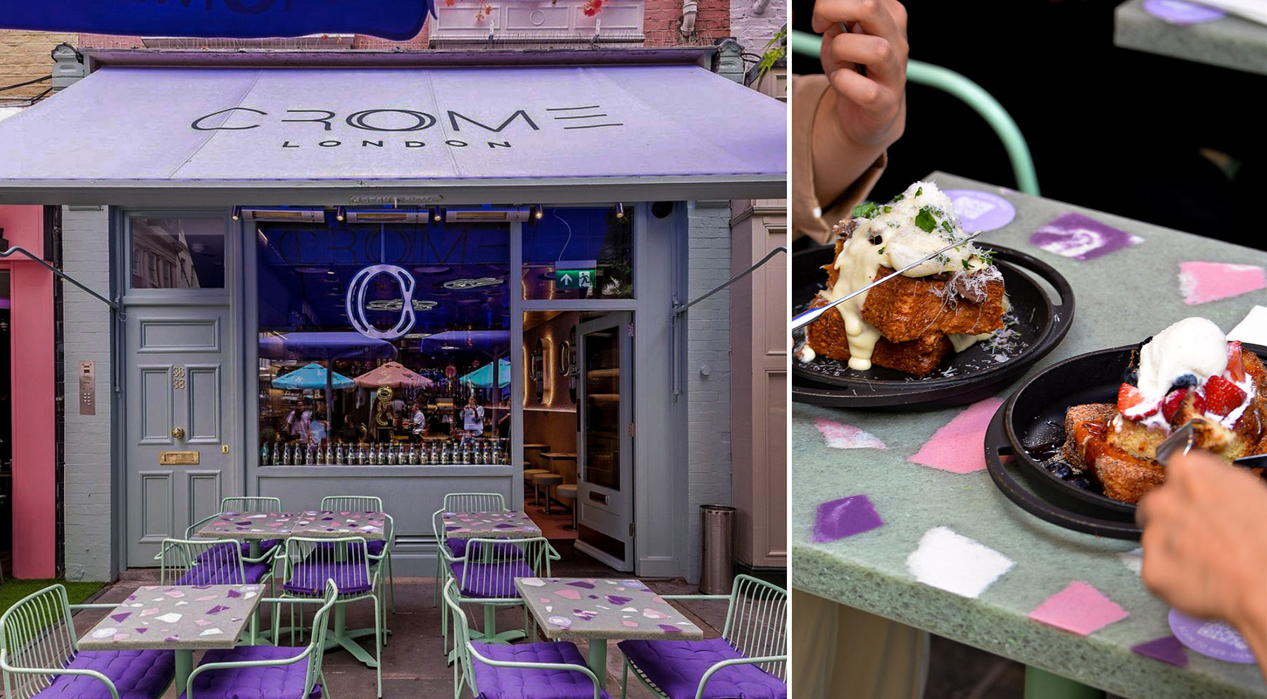
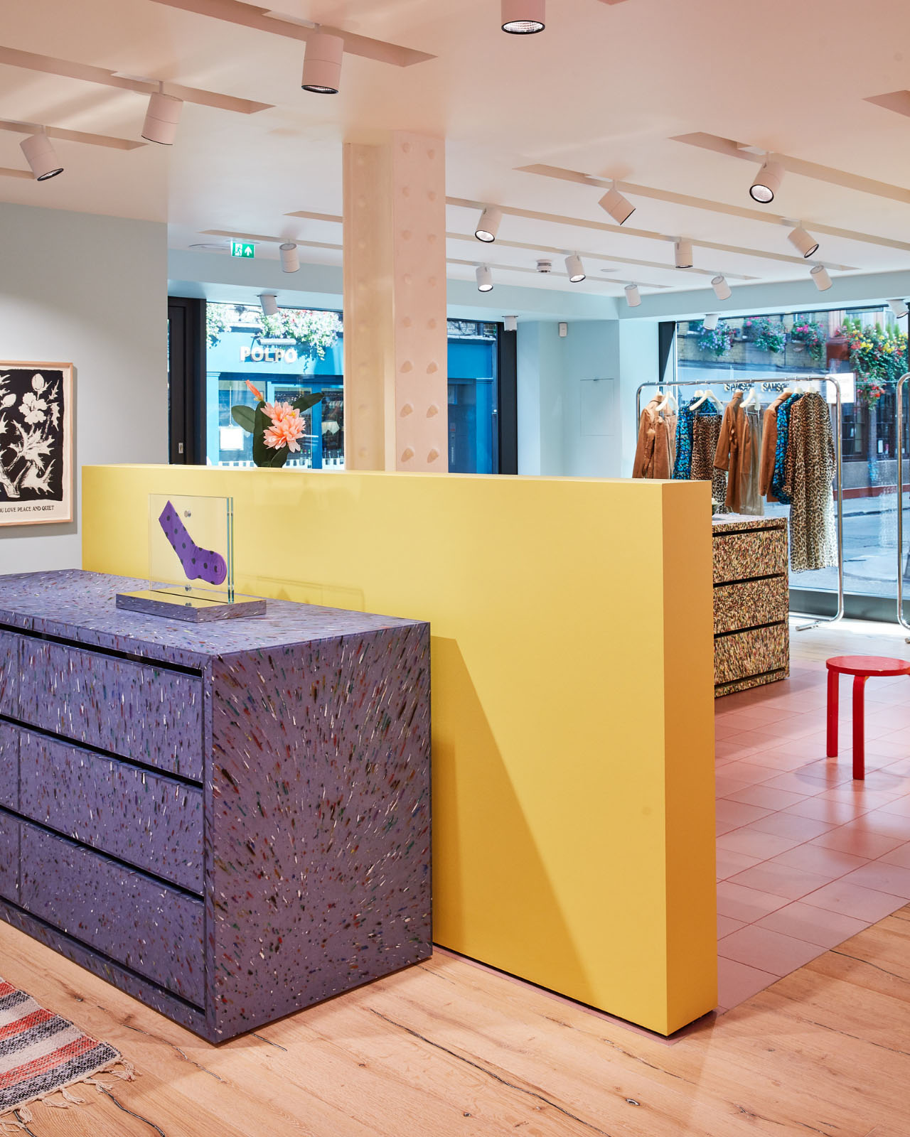
As you’ll see, it’s a combination we’re no stranger to, having created a range of bespoke surfaces in varying pastel shades for our clients. From Crome’s chunky terrazzo effect tables in candy pink, lilac and white – its lilac elements not dissimilar to Very Peri - to a bold pop of purple for Ganni’s custom Kaleido POS furniture and the cool, calming lavender-tinged Grey Mist seating at Bureau, London.

“Displaying a carefree confidence and a daring curiosity that animates our creative spirit, inquisitive and intriguing PANTONE 17-3938 Very Peri helps us to embrace this altered landscape of possibilities, opening us up to a new vision as we rewrite our lives.”
Sitting at the deeper end of the pastel spectrum, combining blue, violet and red notes, Very Peri is both reflective and optimistic. With a slight glance to our recent past, it charges on, full throttle.
“Very Peri is a symbol of the global zeitgeist of the moment and the transition we are going through. As we emerge from an intense period of isolation, our notions and standards are changing, and our physical and digital lives have merged in new ways.

“Digital design helps us to stretch the limits of reality, opening the door to a dynamic virtual world where we can explore and create new colour possibilities. With trends in gaming, the expanding popularity of the metaverse and rising artistic community in the digital space PANTONE 17-3938 Very Peri illustrates the fusion of modern life and how colour trends in the digital world are being manifested in the physical world and vice versa.”

A symbol of the holistic balance that can be achieved between online and offline spaces, Very Peri embodies dynamism and courage for embracing the unchartered. While much has been uncertain over the last 18-months, Pantone’s Colour of the Year for 2022 mirrors our collective desire for moving forward, unbound, into a brighter, pastel-tinted future. Full steam ahead